


How The Last Jedi & Dunkirk‘s Colorist Subtly Manipulated Your Feelings
The son of farmers from near Turin, Italy, colorist Walter Volpatto went from studying electrical engineering at a local university to working at Italy’s national public broadcasting company, RAI. It was here he honed his chops with electronic compositing, lighting and photography. When computers became both ubiquitous and advantageous for his line of work, Volpatto jumped into the digital world with his usual passion and committment. Now, he is one of the premiere colorists working in the film industry, working at the world-renown post-production facility FotoKem. In just this past year, Volpatto’s work can be seen—literally—in two of the most sumptuous films of the year; Christopher Nolan’s Dunkirk and Rian Johnson’s The Last Jedi.
We spoke to Volpatto about his work, which is both incredibly technical and wondrously artistic, requiring the kind of right brain/left brain symbiosis that is rare, even in the multidisciplinary world of filmmaking.

So much of what you do is highly technical—most movie lovers have no idea about color correction—can you describe the importance of your work to our readers, so they understand why it’s so important to a finished film?
The colorist has the responsibility and duty to create the final world and look of the movie. We are always under the direction of the cinematographer and director. It’s a collaborative process. The colorist is part of a global vision, and one of the important steps in making that vision happen – but you are not the vision. Rather, we help the filmmakers tell the visual story the way they want to tell it.
What are you primarily looking for as you set out to work on a film like The Last Jedi?
Two aspects I always look for are coherence and consistency. When a filmmaker creates different worlds for a film, I maintain coherence of those worlds throughout the entire movie. For consistency, think about a chase scene. You have shots filmed in different weather conditions, on different days, so my job is to smooth the inconsistencies and tweak those edited scenes so they make the audience believe it was one continuous action, shot on one day. Another consideration comes into play after you finish a movie. On The Last Jedi, there were several versions for IMAX, Dolby Vision 2D, 3D, Blu-ray, etc. It’s my responsibility to maintain coherence of vision among all the versions.
How much does your work affect the way we experience a film?
Even when films were in just black and white—there was actually a tint in the black and white to conjure specific feelings. A romantic scene was tinted sepia and warm, the dungeon scene in Phantom of the Opera was tinted blue-green. Colorists play with creating these worlds. If you think of music, you don’t hear the score per se, you feel it. Colorists make those subtle enhancements to the original photography to help an audience feel the emotions of a scene.
Let’s discuss some specific moments in Last Jedi that stood out to you.
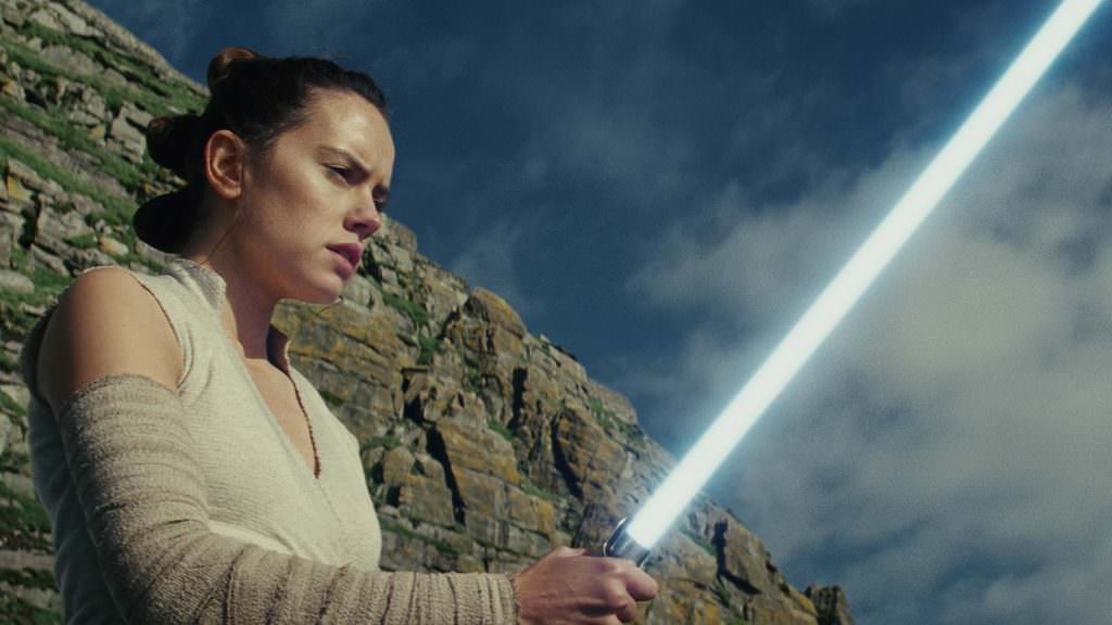
A scene that reflects both the coherence and consistency I mentioned are the scenes where Rey is practicing with the lightsaber on Ahch-To. It’s set on a cliff, with the camera going through a lot of different compositions – close-up, wide shot, etcetera. The scene was shot over the course of a day and a half, in a tough environment on an island off the coast of Ireland. They didn’t have much control over the light. So, the first thing we did was to select hero shots with the cinematographer Steve Yedlin. In that review, we asked ourselves, ‘What’s this sequence about?’ She’s hopeful, she’s training, and she has this beautiful vision in her mind of what Luke will do for her. This is a whole scene that is bright and beautiful, so that’s the coherence we need, the world we’re creating. But because of environmental challenges, it would go from sunny to raining. So, my work was to change the elements to make the audience think it’s one continuous moment. This is the consistency. It was probably the most challenging scene in the film.
The opposite would be the scene set in Snoke’s lair, the Red Throne Room scene, which was just gorgeous. There was almost nothing I had to do to make it better. Because the light was controlled, Steve could put every setup in the room as he wanted it. As a colorist there’s no way to make it better; you just fine-tune the shots to blend the real shots with the VFX. You don’t have to fight the elements, exposures, etc., it’s really well shot to start with, so it’s about fine-tuning what’s there.
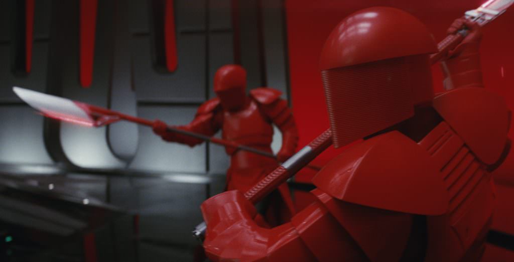
Yet there were still some subtle changes with the Red Room, because it is seen in different stages. At the beginning, the audience sees the relationship between Snoke and Hux, and then Snoke and Kylo. When the action takes a turn, the mood of the room changes. The dark side of the Force takes over Kylo, and it’s a very subtle change. The tweaks we did were to reflect the feeling of the new relationship between Kylo, General Hux and the whole First Order.
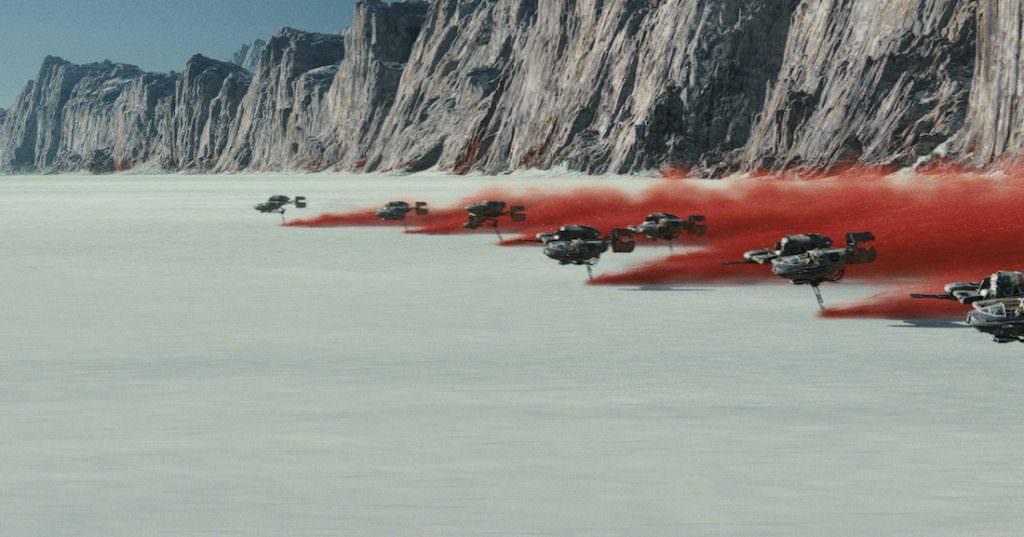
What about the gorgeous scene on the planet Crait at the end of the film?
The sets were gorgeous, as beautiful as they could be. The concept art started very early, and I was able to see some of the behind-the-scenes where Rian really wanted the feeling of a big planet, with salt flats, and incredible crimson red coming up beneath the salt.
©2017 Lucasfilm Ltd. All Rights Reserved.
They went to Bolivia to shoot these big plates that Industrial Light & Magic used to add the crimson plume behind the speeders. For those shots, most of my job centered around keeping the VFX consistent while maintaining the feeling of an epic battle. The mood changes slightly when Kylo Ren and Luke face off. You can see the battle gets really intense, and then suddenly it calms down. Steve and I want to give the two actors time to face each other, so the color got more subdued. You see the salt coming down and dropping, and when you reveal at the last minute that Luke isn’t there. The contrast between the white salt flats where Kylo is, and the warm sun where Luke is, looks just amazing. Keeping those two worlds real was a challenge, but also fascinating. The look of the scene contributes to the emotion.
How did you approach your work on The Last Jedi? What kind of research was required?
I’m lucky because I worked previously with the DP, Steve Yedlin (on San Andreas). His technical literacy is profound, and he has a very strong understanding of color representation and how the camera works. Steve wanted this movie to have the look and feel of The Empire Strikes Back, hence a very photochemical, filmic look. He worked with us prior to the commencement of production so we could devise and calibrate the whole color pipeline. We started with a photochemical look and feel, and applied color science to all the digital sources in order to make them look and feel like film. Steve created mathematical models to guide us, and we integrated those into the pipeline. By the end, the bulk of how he had hoped the movie would look was right there. Devising a look for a movie generally starts early, in storyboards and paintings. The question then becomes, ‘How do we create those worlds with the technology we have?’ By working on this ahead of time, I went back and looked at the original trilogy, and I looked at Force Awakens, to see where the audience’s expectation might be.
You worked on two of the most visually stunning films of 2017, Dunkirk and The Last Jedi. Can you compare your experience working on them, with such talented directors and crew? What were the goals for each?
Well, first and most important is that there were different creative teams with different methods and aspirations. There were two gifted cinematographers with different visions, so naturally the goals were completely different.
In Dunkirk, the hero is the film print. Hoyte van Hoytema, the cinematographer, and Christopher Nolan wanted to have an entirely photochemical workflow. They wanted to make a movie like they were made back during WWII. Every single shot you see in Dunkirk was finished in film first. They love the photochemical process, and most of the look of Dunkirk rests in how the photochemical film reacts to light. We tend to forget about that and it’s an incredible creative approach.
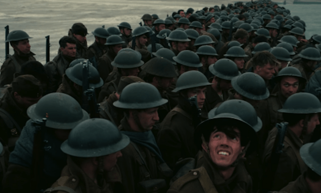
We spent more than three months making sure the digital version of Dunkirk was a faithful reproduction of the photochemical process. It was more technical and scientific than creative. On one hand, a colorist is an artist, and on the other hand, you’re a craftsman, a technician who brings these different elements together to create a movie. Our goal was to make sure the digital version of this film conveys the same feeling as a photochemical print.
We started by profiling how the negative and positive react to light. Can the digital and film match perfectly? No, but we used all the technical and creative expertise in our facility to make it as precise a process as possible. It took us three months to keep all the nuances of Dunkirk intact, a movie with a lot of blues, and a lot of drab military colors. It’s very easy to saturate those or put contrast back, but we didn’t want that. In addition to the color science pipeline, we played the film and digital scenes side by side in our DI theater so we could be sure the two prints were as similar as possible. It was a privilege to see a photochemical print of Dunkirk. I was holding the hero print of Dunkirk in my hand, threading it on a 70 mm projector, thinking ‘I better not scratch this!’
How readily would viewers notice if a film’s color wasn’t quite right? What deficiencies are you looking for, and how do you fix them? What are the main challenges you face?
For an audience, it’s about consistency. If you see a scene that has shots that aren’t consistent, that’ll stick out. If the shots seem to take place in a different place or time, that’ll stick out.
For color, it’s more subtle. Why am I feeling this way? It’s a romantic scene, but I’m not happy or sad for the couple. That might be because the color is drab, or not helping you feel the right mood. That incoherence is something audiences can feel. You come out of the film and feel like something in the movie deceived you.
Is there a film that you would cite as a particularly perfectly colored film?
That is very difficult to choose, but I’ll give you two answers. I really like The Artist. I love black-and-white photography; I wish I had more chances to work on black-and-white films.
The Matrix is another one. I liked (the original) from the first time I watched it; I really thought the idea was amazing—I loved how clearly the world inside and outside the Matrix was defined in terms of color, and that the image conveys immediately where I am in the story. It’s more subtle than a character telling me, ‘I’m in the Matrix! I’m outside of the Matrix!’ The color tells you that without any misunderstanding.
Featured image: Praetorian Guards in Snoke’s throne room. Photo: Industrial Light & Magic/Lucasfilm. ©2017
