Mad Style: The Man From U.N.C.L.E’s Production Designer Oliver Scholl
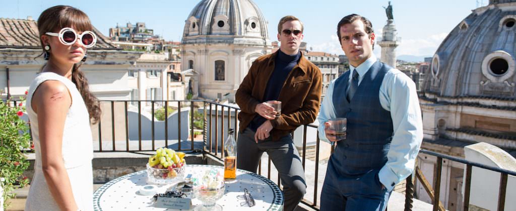
Guy Ritchie’s latest film The Man From U.N.C.L.E. is a remake of the 1960s TV series, starring Henry Cavill, Armie Hammer and Alicia Vikander. The spy film, set at the height of the Cold War, is a stylish ride, shot through with humor. The Credits talks to production designer Oliver Scholl (Jumper, Edge of Tomorrow) about how to achieve a stylish, rather than stylized look, and the challenge of creating “Frankenstein” scenes.
Was it fun, from a production design perspective, to work in that period?
Yeah, it was fun on several levels. It was a fun assignment because of the period. It was a fun assignment because of the genre of movie. And because of Guy himself and the history of movies he’s done before. So, it was a very interesting combo.

How did the job come about?
When I got the initial call to meet with Guy and [writer/producer] Lionel [Wigwram] about a remake of U.N.C.L.E. as a ‘60s’ spy film, I was a bit skeptical about it. I haven’t really done period period, so it was a bit scary for me. I did The Time Machine for Warner Brothers quite some time ago which featured turn of the century New York, but besides that I haven’t really done period. So this was kind of a fun starting point. But, then again, it’s not a documentary and I don’t think it’s really a film about the ‘60s either.
So, it’s not like you’re at Mad Men levels of accuracy?
Yeah, I mean we want to get it right and not have obvious mistakes in it but it serves a purpose. It’s more like an homage and it revisits this period from that point of view.
I understand the brief you got from guy was to create a glamorous 1960s feel but with an edge. In broad strokes- how did you set about achieving that? I imagine it’s a pretty delicate balance?
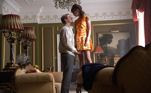
[laughs] Well, there’re two different ends that you start this from. On one side your start with research and historical fact and you look at the period. What did Checkpoint Charlie look like in those days? What did Italy look like? What happened in Rome in those days? What was the situation? You do your homework as best as you can or as best as time permits. And then, on the other hand, you deal with the practicalities of where your production is located and what’s there and what can be achieved. And, as a designer in any field would- my background is product design- you create your own framework that kind of determines what the design will be and how it evolves. So the framework is production parameters, your personal liking, and the brief you get from Guy, from the writers and from the people you work with. I’m not working in a vacuum, I’m working with a great set decorator in Elli Griff and an amazing costume designer Joanna Johnston, so all of that plays together to influence what ends up on screen.
How did the script inform your work?
The cool thing about U.N.C.L.E. is that there was a very clear structure in the script of what the world is and what the journey is. We start in Berlin and that is kind of the grim reality, and then you go on this adventure, which is kind of, in my eyes, from Gaby’s [Alicia Vikander] point of view because she’s the one who’s taken the most out of her normal world. Out of East Germany, going to the West and then going to Italy.
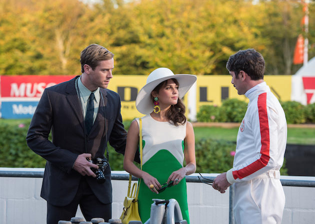

So it’s really fun to go over there with her. I think that even though the obvious thing would have been to do the grim Berlin world and all of that, and some of that happens automatically if you deal with the wall and the environment that existed then, but you also have a bit of a fun world in terms of West Berlin.
With you’re dealing with a period like the ‘60s, which has been immortalized on film so many times, how to you avoid slipping into those sixties visual clichés?
I started by watching the television series. I did a weekend of binge watching. And to me the stuff that I couldn’t get out of my head- which was scary- was more the fun version of U.N.C.L.E. which was like Get Smart, more goofy and whatever. Then, obviously at the top level there’s Ken Adams’ iconic designs for the James Bond movies. And then the Italian movies like La Dolce Vita.
A lot of them, in black and white, were quite ingrained. And then we went and pulled out some collections of Domus magazines from the ‘50s, ‘60s and 70s, for the architecture and interiors. We just sort of browsed through what was there. Then you reach a point where you’re like: I don’t have a clue what I want to do with all this. You have overload and you don’t know what you want. You basically put it all in the corner and you just start it. The pressure is rising and you have put it on paper. You have to bring something together. And you just do it. Once you sit down and you make your initial choices, you get feedback from everybody else and that kind of pushes it different directions. It was interesting working with Guy Ritchie, he was much more hands off and broad strokes than I was expecting. And I had to kind of get used to that. In the end it was very freeing as a designer. But it’s also scary because you can’t just say the director wanted it that way. You have to stand behind it.

How do you approach incorporating iconic sites like the Berlin Wall, and Checkpoint Charlie and even the Spanish Steps, and weave them into the look of the film and not have them appear too archival?
One thing I have to point out, on top of everything is the cinematography itself by John Mathieson. He is of course the key element. You provide all the bits and pieces and the sets, but to make the action come alive, the actual point of view, and where you place the camera, and how you light it, that’s John Mathieson. And though we work together and you discuss things, in the end, it’s his choice. I have to say I was really mesmerized watching the movie with how he pulled everything together.
But on the conceptual side, on the design side, the way you do that is, from the beginning our premise was to be real about things. Even though it was supposed to be stylish, it wasn’t supposed to be over the top. It was not stylized per se, so we didn’t make Checkpoint Charlie pink or purple or whatever. It was all very much matter of saying, ‘Well this was what was there.’ We did stylize some elements in terms of things like the wall the lay out. There was a kink in it at an earlier point in reality that we decided to have a bit straighter, so it’s a bit stronger and reads quicker visually. So there’re translations for filmmaking that are not real but are not incorrect per se. But these little tweaks help you- in the end- bring these elements together.
A big discussion we had was, ‘Well, you are in Rome- what locations do you use for showing Rome in the ‘60s? So, we scouted a lot of locations and we fell back on the really iconic locations without trying to be smart and fancy and funky. We had beautiful research period photographs of flowers and shops around the Spanish Steps, so we were able to recreate that.
I guess the more iconic the location, the more reference pictures and things you have from that period?
Yeah, well you can be lucky and run across a photo of a not so known location, but, on the other hand, you want to characterize the period and you want to characterize the things and the spirit that were important at that time. Because everyone traveled there and that was what Rome was known for, you pick those elements.
And then you have location choices where the action determines what elements you want and then you need to find those elements and find a way of combining them, which to me was the most fun of the movie because it’s the least obvious. Well, I hope, at least.
In the big chase scene some of it’s shot in England, some of it’s shot in Italy… it’s all shot in different countries and brought together?
Yeah. I call them Frankenstein sets because they’re made out of pieces of real things. And that’s the other tool I wanted to get to. So you have the cinematography tying things together, editorial tricks, treatments and selections, then you have visual effects creating a continuous transition between things that don’t have anything to do with each other.
And when you’re working on a period piece, you have to get all the details right, the graphics, the shop windows and those kinds of things. From your perspective, what are the most important details that anchor that period?
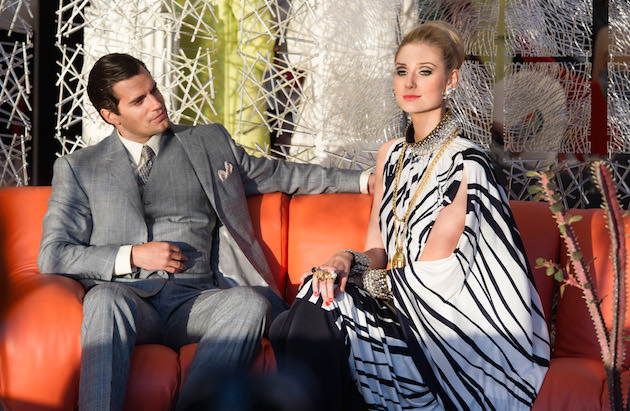
You have a hierarchy in design. I think, conceptually and how the camera moves in space is really important. So getting the starting point of the architecture right is important. The architecture provides an envelope and within that envelope you have the things that much more immediately scream what period you’re dealing with. Especially in modern times. If you’re in the Middle Ages, obviously the architecture is completely different and you know what you’re looking at, but if you're in the ‘60s,‘70s, ‘80s…there were changes in architecture and in construction technology that reflect back to how things were built, but in the overall scheme of things the changes were not that big, so if you go to a city like Rome- it’s often said about Rome that it’s a timeless city because architecture is so old and so iconic- and that’s why we went there, because you go there 100 years ago or 40 years ago, and it’s mostly the same. You just take the antennas away and change out the cars in the immediate foreground. So the architecture is an important choice. Then there's the clothes— you get a very immediate impression that gives you clues as to what time you’re dealing with thanks to Joanna’s costumes, that are right in front of the camera, and any props that the actors are using. They can’t pull out an iphone or something like this. They have to use old plastic phones. The spyware they’re using is so big and clunky that you laugh. Modern technology has kind of killed the spy film. You have so many spy films that are like, ‘Oh ok, so now we’re going to hack into the system, we’re in the system and we’ve been staring at a monitor the whole time.' So luckily, even though they were using modern high-tech technology for the time, for us it is old-fashioned and kind of funny.
So, you said you were scared in the beginning because you hadn’t had much experience with period films. And now you’ve done it. How do you feel about them now?
[laughs] I mean every movie is challenging. I love science fiction and that has its own challenges. I do think it’s an artificial perception to say a period movie is more challenging. I think if you’re going to be really totally specific to the period, you’re going to spend a lot of effort invoking details and it’s a matter of having the right support structure to be able to pull that off. But in terms of the overall design challenge- because the job is not to invoke the period- the job is to support the story, and that is the job for all movies. I think it’s always a bit scary starting a new project but that’s why you do it.


